


trends we’re into: digital silkscreen
We spend a fair bit of our day scrolling here and there, and we enjoy this fresh graphic style that’s caught our attention. These graphics are digital, yet don’t look totally “digital.” The added textures and the flat or flatish areas of color remind us of silkscreen work.
We love all things design and keeping our eye on trends, but the digital space isn’t our area of expertise. So we reached out to friend and designer April Befort-Neumann for her take.
How would you describe this style?
To me this is that cut paper layering technique that was popular in the 70s and 80s — I remember my elementary school textbooks in the 80s having that style — but done on a computer now with modern colors. You build your image by layering colors and shapes on top of each other in Illustrator vs. using more painterly tools in Photoshop.
What elements do you see at play here?
I think color is playing a lot in these examples, I am seeing a lot of human-centric colors, natural palettes with blues, pinks, browns, and oranges this year. Color can really make something digital transform into something rich and warm. The right color choices can make a flat shape on the screen feel like velvet or silkscreen.
These illustrations are definitely about the human experience and it's a more controlled way to tell a story than purchasing stock images.
Why do you think it came up and is gaining popularity? Why now?
People have been at home and it's difficult to stage photo shoots in the best of times, much less during a pandemic. Also, new programs on the iPad and other devices are making illustrating a lot of fun and much easier than before. An advantage to this illustration style is that it is done typically by making vector shapes. That means the image can be blown up infinitely. You can make a billboard if you like. Whereas a photograph has resolution limitations.
Any advice for designers hoping to employ this style?
In some examples, you can see the illustrator made fun, round figures. In other examples, you see skin tones in purple, hot pink, or green. It's a great way to have fun with color and scale. Expressing the vibe and life of whatever it is you are marketing with wild colors, shapes, and scale may reach more people, over getting caught up in realistic visuals with more "normal" representations of humans. So I would say play and be fantastical if you want. Check out Frankie Magazine for inspiration. They publish wonderful illustrations in this style but do it amazingly well with really sophisticated color palettes. I would say stay away from stock illustrations. This trend is so heavy now, I immediately recognize when something was a custom one-of-a-kind illustration and what was purchased on a stock image site.


7/11/2022 update
After getting our hands on a copy of How to Zoom your Room by the brains behind RoomRater, we put their advice to work in this mini kitchen-in-a-kitchen. Pineapple points: achieved!


bored of boards? enter the mood bowl

A mood bowl picked for an Autumn mood.
We’re all familiar with mood boards. And if you’re familiar with working with clients, then you know how helpful, and often necessary, having a tangible set of inspiration bits can be to aid moving from idea to visualization. A lot of people struggle to envision how a design will come together, and shy of some impressive psychic ability, we can’t expect others to know where a project is headed if it’s only, well, in our head.

Mood board example, created for a client’s guest bedroom.
The above mood board, circa 2010 comprising natural linen hopsack with indigo dye pattern over silk check curtain fabric, and maize-inspired colors like Beeswax and chestnut-y colors like Old Gold (pictured here as paint “chips”). You probably recognize many of the hues as they’ve cycled back in style.
When planning a new scene, we’re big fans of the mood bowl. Spying and sorting through little bits to add to the collection, placing them all together in a creative cauldron is a tactile and satisfying ritual. It’s like handpicking only the best ingredients for some creation yet to be concocted. Highly recommend. And, bonus points, these beauty bowls can double as decor.


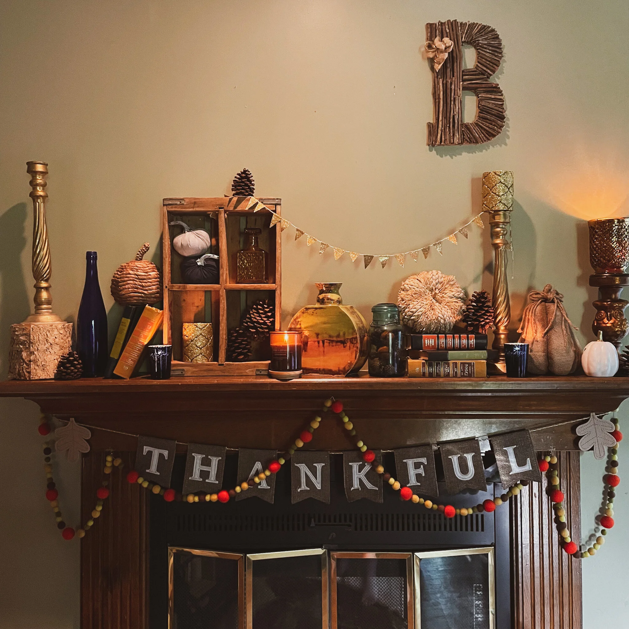
The Three L’s of My Fall Mantel
Mantels can be as simple or as complicated as you want. They can follow a color story, theme or like mine, be a hodgepodge of collected items from over the years. I really only have one rule for my mantel: Everything MUST fit in one storage container.* It’s a mantel. Not a Christmas tree, but more on that some other time.
*Fall-specific decor, but feel free to pull other items from around the house.
Yes, we all love elaborate mantels on Pinterest, but then you have to store all that sh*t, and let’s be honest; unless this is your first year, you have enough sh*t in your [insert storage space of choice]. Even if I buy something new, as I did this year, it means something must go if it all doesn’t fit. But I will say, I have a black belt in how to organize a store container.
Otherwise, it’s game on. The rest is up to you, go for what feels good or have a plan. As a Virgo, I like lists and planning, so for me, I look for three simple things when putting together any decorated space: levels, layers, and light.
Levels
This is a pretty basic one, but as a graphic designer in my professional life, I like to think about what you’re looking at from left to right and I don’t want it to be the same across the line. So I build things up to varying heights to give some visual interest. And no, that does not mean it has to be symmetrical. Unless that’s your preference and then, hey, good for you. For me, I spent a sh*t ton of time on this and I want you to look at it for a minute or two. It’s about the details.


Layers
While mantels are usually fairly shallow, you can fit way more on them than you think! Using things like wood crates, books or candle holders can be used for stacking and creating depth. Also don’t be afraid to let things hang off the edge or droop over if you need to. Maybe you put a pine cone at the bottom of a candlestick or a small pumpkin on top of a vase. Anyway you like it, use this tip for fitting more on your mantel.


Light
Yes, candles. But also think about where your natural light or light from your fixtures hits your mantel. Mixing metallics, glass, and other shiny things can also help give your mantel depth but reflect light into the smaller, darker spaces of your mantel.

Color is another way to help direct light. When you think about colors, think about coordination and contrast. Lights next to darks, shiny next to flat.

Just for fun, here is my list of random objects that I keep around and have sourced from all over. Thrift stores have a ton of great items, as do garage sales and yes, even Target and Big Lots. But I don’t think I’d go outfitting my mantel from a big box store. The trick for me is mixing it all together like you planned it.
Ingredient list:
Candlesticks
Old books
Garlands of any sort, paper, fake foliage or felt.
Dried items
Ceramics
Wood
Crates or containers
Candles
Candle holders
Photos
Pine cones
And of course, Pumpkins, but not just real ones. Raffia ones, ceramic, glass, etc. After all, It’s decorative gourd season.
winning entry: introduction
How do you create a welcoming approach to your own abode or staged property? Start with the story you want to tell. The message you want conveyed will begin unrolling with the first view by guests or potential buyers. Conventionally known as “curb appeal,” this view sets up expectations for how the property is perceived. Tidy, but messy-ish in the right, naturalistic way, balanced, properly lit and easy to approach, the front porch, deck, stoop, or landing SHOULD, introductions being made and cartes-de-visite properly exchanged, usher the visitor through a congenial portal into a gracious space within.
Shut The Front Door!
It’s THAT easy?

Well, generally speaking, yes. Again, how is this accomplished? We recommend taking it step by step…
Ah ha ha… hum.. whoo boy. Sometimes we crack ourselves up…
Also, we are not seeking sterile perfection, but progression...
In truth, setting up a winning entry does consist of a series of stages as well as staging. Contrast large elements with small, combine and cluster pots of fresh plants with small additions of seasonal decor. This may mean raising up certain elements and adding in a small amount of contrasting color.

Symmetry has its place in the design world and matching pairs of containers for live plants exude a sense of formality demarcating the FRONT DOOR. We like to goose…ahem.. the staid regularity slightly in favor of whimsy by adding a touch to one side or other: another, smaller, planter or garden sculpture.

Plantings well suited to containers with a punch of color… the Fall Y’all police might see a violation but we are happy with a violet nation… ok. pink. pink nation. And these are impatiens, but so are we with conforming to strict ideas of “seasonal.”

Set a scene for an event with faux material combined with the natural.

Check out our Pinterest board “Winning Entry” for more ideas and suggestions!
…and the award for Winning Entry for 2020 here at Cordelia and Co Design goes to (we are a leeetle more open now… but not much)

file this under “old school”

Finished, upcycled table.
We are all looking for ways to move furnishing in a sustainable direction. One of the best ways is to reuse pieces that have already been made. Upcycle furniture from home, internet lists, or hit the thrift shops or yard sales (with your mask ON, please) and make something old new again.
A quick update in a fresh color gives a basic piece new life. Here we have taken a cue from old files and used what was heading for the trash bin as part of the decor— doubling our recycling cred in the process. (Sping!)
Using parts of letters and envelopes, pretty paper hand towels, and other paper ephemera, we collaged the top of a rather nondescript, simple school desk using a classic glue adhesive like Mod Podge. A little thoughtful layout created a gift lovely enough to go to anyone, but, in this case, a personalized keepsake for the recipient.

Saved article from Better Homes and Garden that inspired this project. Does that say 1997?!
styling & staging
Staging is a concept best applied to temporary design opportunities wherein some theatricality is encouraged: property sales or rentals, holiday decor.
Styling is the everyday aesthetic of balanced beauty.
We style things all the time in our lives everyday. It is a choice that brings more calm and a harmonious atmosphere which promotes a more settled headspace. This past year? Well, we did not have Calgon, so SOMETHING had to take us away…
We were home All. The. Damn. Time.

Staging is a concept best applied to temporary design opportunities wherein some theatricality is encouraged: property sales or rentals, holiday decor. Styling is the everyday aesthetic of balanced beauty. Styling is part of staging. Taking the skills used to create warm, comfortable living spaces can be amped up for staging rooms to be presented in sale properties. We can show you how.

Styled mantel. Balanced beauty, but not symmetrical.
We style things all the time in our lives everyday. It is a choice that brings more calm and a harmonious atmosphere which promotes a more settled headspace. This past year? Well, we did not have Calgon, so SOMETHING had to take us away…We were home All. The. Damn. Time.
To be honest, once you get going, it is a bit of an addiction. Seeking a balanced composition in the small affects the large. Then everything exists in a “better” relationship to each other. Except people. People don’t always get it. Our partners are not on board with the “perfect” arrangement of plastic bottles on the vitamin carrel, (with labels, with their shrieking fonts, turned to the back, and tallest at the rear, ‘natch, ) but it LITERALLY causes us pain when the bottles are out of “order”…
Stretching…
Envisioning the perfect calm of Velazquez Las Meninas or Degas’ dancers.
Aaaaaand we’re back.
Styling should fall within the realm of actual living conditions. Objects not on Broadway, but in mostly permanent exhibition behind the museum glass? Well, not really, but you know what we mean! Umbrellas are great to have by the front door, says all dog walkers everywhere but especially in Seattle, but they can be corralled in an attractive container rather will-aye nill-aye all over the floor.
We get asked all the time by folks who are searching for better decor and more peace in their lives if “calm” is equivalent to empty or they ask us while holding an armful of objects while absentmindedly stroking great aunt pearl’s button back chair like an old collie. You know that chair is not going to “live on a farm” if you take it to the share shed, right?
The question we asked, long before decluttering became the hottest new hobby, was “Do you love your things?” — if you love your things, do you want to make your space work for YOU.
Here’s the big thing? It’s not the clutter. It’s how the clutter occupies the space.
Styled “We love our things” vs. Real Life “We love ALL our things”:


Styling outfits— finding the right balance of pieces and accessories to highlight the positive and elide over perceived deficits with the goal of feeling sharp. Check that. Before we stayed home for a year and all we wore were pajamas.

A styled outfit.
Here are some of our styling & staging boards for more ideas: