trends we’re into: digital silkscreen
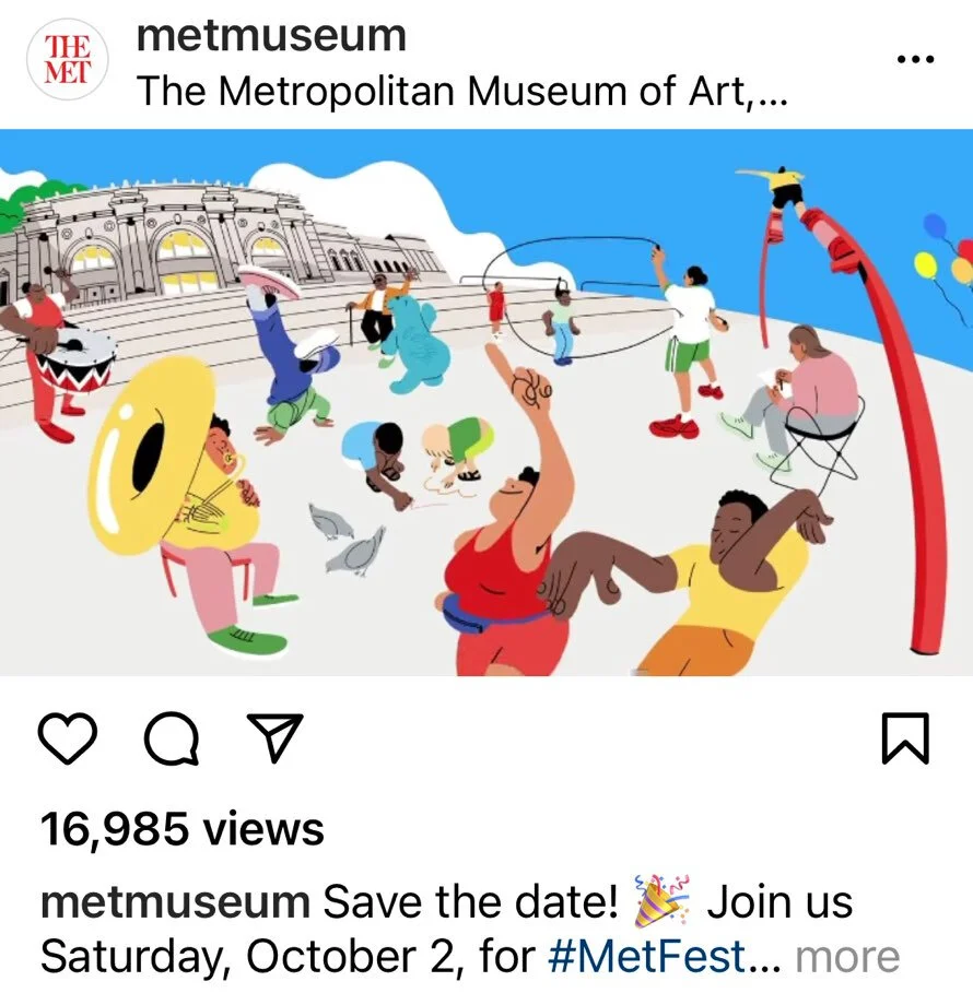
We spend a fair bit of our day scrolling here and there, and we enjoy this fresh graphic style that’s caught our attention. These graphics are digital, yet don’t look totally “digital.” The added textures and the flat or flatish areas of color remind us of silkscreen work.
We love all things design and keeping our eye on trends, but the digital space isn’t our area of expertise. So we reached out to friend and designer April Befort-Neumann for her take.
How would you describe this style?
To me this is that cut paper layering technique that was popular in the 70s and 80s — I remember my elementary school textbooks in the 80s having that style — but done on a computer now with modern colors. You build your image by layering colors and shapes on top of each other in Illustrator vs. using more painterly tools in Photoshop.
What elements do you see at play here?
I think color is playing a lot in these examples, I am seeing a lot of human-centric colors, natural palettes with blues, pinks, browns, and oranges this year. Color can really make something digital transform into something rich and warm. The right color choices can make a flat shape on the screen feel like velvet or silkscreen.
These illustrations are definitely about the human experience and it's a more controlled way to tell a story than purchasing stock images.
Why do you think it came up and is gaining popularity? Why now?
People have been at home and it's difficult to stage photo shoots in the best of times, much less during a pandemic. Also, new programs on the iPad and other devices are making illustrating a lot of fun and much easier than before. An advantage to this illustration style is that it is done typically by making vector shapes. That means the image can be blown up infinitely. You can make a billboard if you like. Whereas a photograph has resolution limitations.
Any advice for designers hoping to employ this style?
In some examples, you can see the illustrator made fun, round figures. In other examples, you see skin tones in purple, hot pink, or green. It's a great way to have fun with color and scale. Expressing the vibe and life of whatever it is you are marketing with wild colors, shapes, and scale may reach more people, over getting caught up in realistic visuals with more "normal" representations of humans. So I would say play and be fantastical if you want. Check out Frankie Magazine for inspiration. They publish wonderful illustrations in this style but do it amazingly well with really sophisticated color palettes. I would say stay away from stock illustrations. This trend is so heavy now, I immediately recognize when something was a custom one-of-a-kind illustration and what was purchased on a stock image site.


7/11/2022 update
After getting our hands on a copy of How to Zoom your Room by the brains behind RoomRater, we put their advice to work in this mini kitchen-in-a-kitchen. Pineapple points: achieved!

