top trends: early 2022
IN:
Wearing N95 masks or double masks.
Vaccinations for littles.
Animated sparkles, especially in video.
The moon.
Pop-up cards, especially in place of flowers.
Natural cotton cord.
Painter’s pants.
Work aprons for all, recognizing that women work in shops.
Tarot.
IOT for households— see self-aware warming coffee.
Cupboard games, especially customized unusually shaped puzzles.
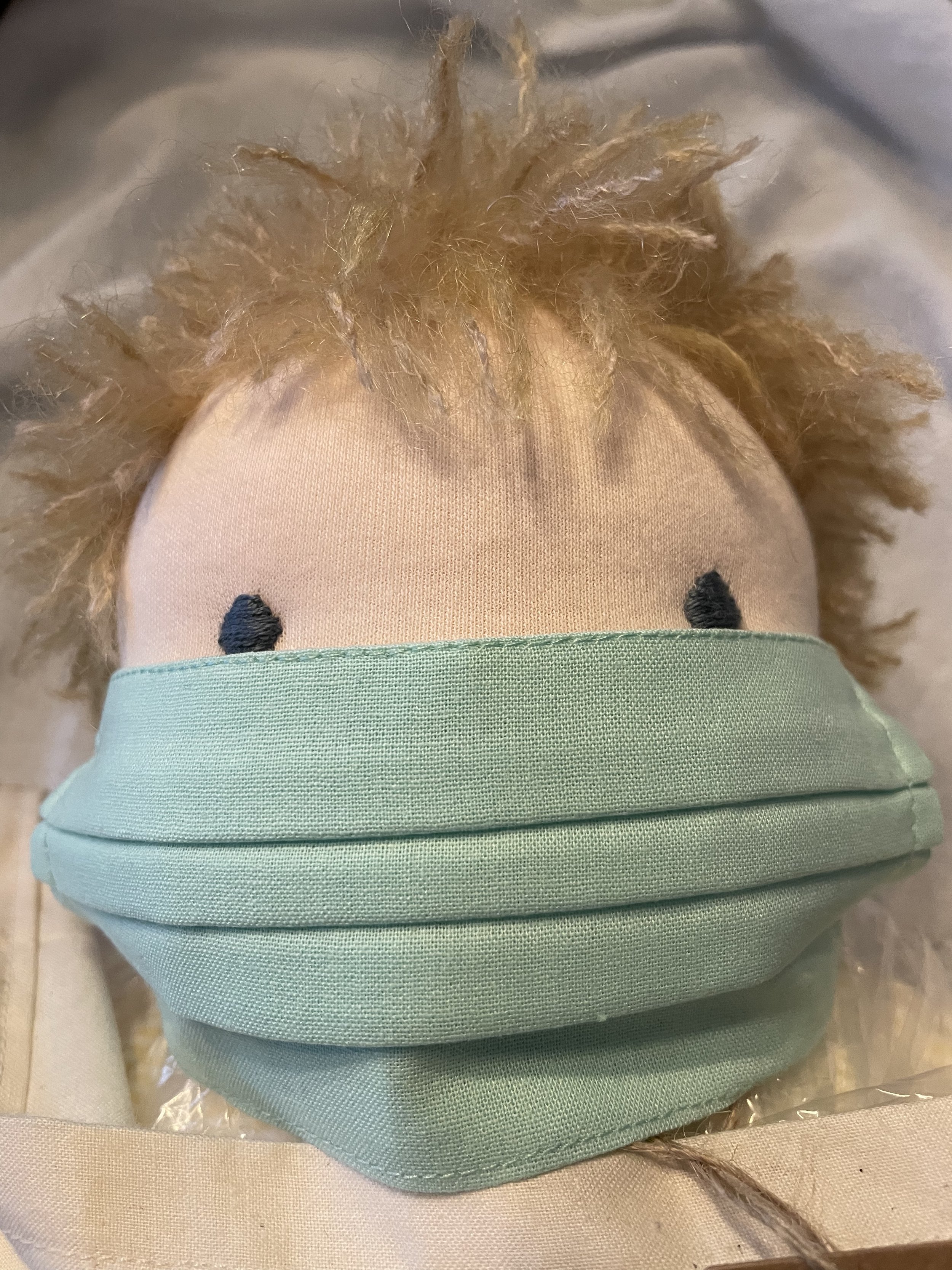
Waldorf-inspired natural and handmade toys and learning materials.
Retropalooza for the 1950’s, especially in horribly backward political thought — but also in design.
Porting your playlists to other platforms.
OUT:
Facebook.
Spotify.
Horribly backward political thought.
Not wearing masks.
trends for 2022, post-hibernation
The end of one year and on to the next means we spend a little time with the crystal ball to stay ahead of emerging trends.
Not that we are all going anywhere if we have any sense at all, but these things will be on point when we emerge, chubby, blinking in the light, in spring ready to caterpillar-> cocoon->butterfly it out into a better world. 2022 will zing back and forth between comfort and outrage. Not unlike the news cycle. Calling it now.
Trends
IoT (internet of things and they will all “talk” to your handheld and, worse by far, LISTEN.
Machine Learning— see above, but not as nice as Star Trek’s Computer. Also, they will NFT us out of the art mart.
But also, thankfully, a resurgence in hand learning and creation. Encouraged to see so many young people into learning how to create, how to grow their own, and developing a deep appreciation of the slow processes of making.
Nostalgia of all types, but particularly the kitschy, the western— so cowgirl cute, with fringe and boots and pearl button pockets.
Lightweight neutral trench coats in silk or tencel.
SUPER high-water pants, jeans… hate to tell ya’ll, but leggings are on the way out.
Cotton gauze and corduroy, 1970s brown/green/mustard prints— think wearing your cottagecore living room around town.
Doc Martens… frankly, never out of style.
Combat boots worn with your 1980’s romantic prints, cotton florals, puffy sleeves… calling Laura Ashley!
Uber-saturated eye popping color because we are tired, tired, tired of neutral. Hell, maybe even in vinyl. Don’t forget your poodle perm hair and Blondie shades.
trends we’re into: digital silkscreen
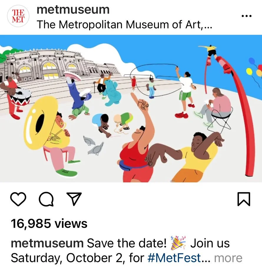
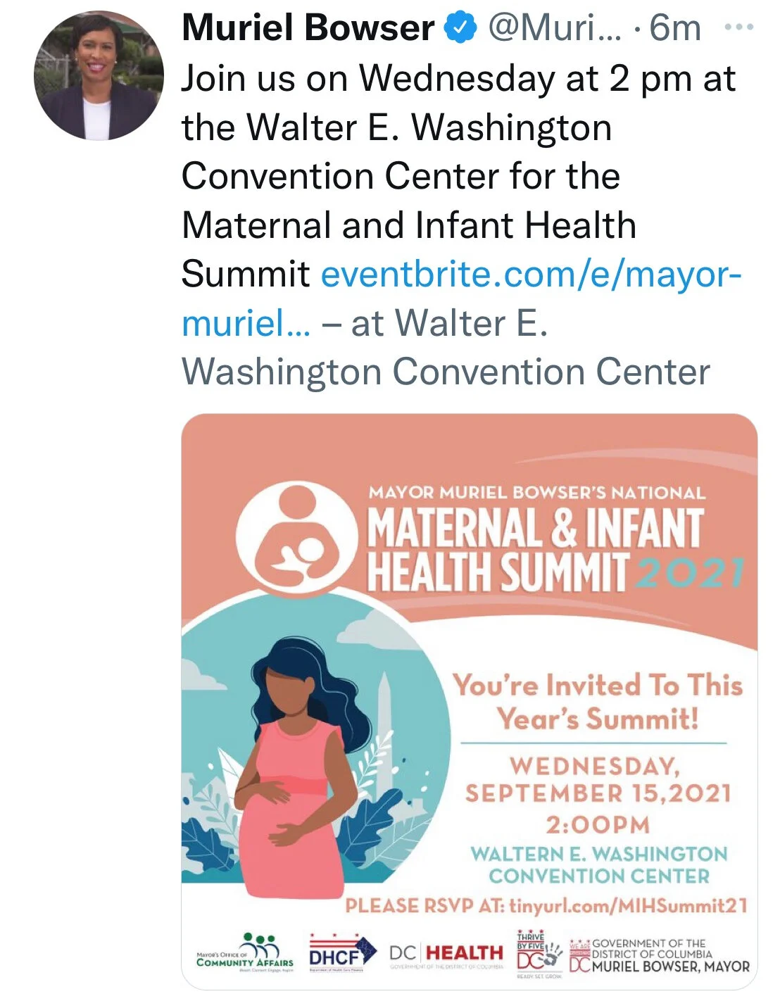
We spend a fair bit of our day scrolling here and there, and we enjoy this fresh graphic style that’s caught our attention. These graphics are digital, yet don’t look totally “digital.” The added textures and the flat or flatish areas of color remind us of silkscreen work.
We love all things design and keeping our eye on trends, but the digital space isn’t our area of expertise. So we reached out to friend and designer April Befort-Neumann for her take.
How would you describe this style?
To me this is that cut paper layering technique that was popular in the 70s and 80s — I remember my elementary school textbooks in the 80s having that style — but done on a computer now with modern colors. You build your image by layering colors and shapes on top of each other in Illustrator vs. using more painterly tools in Photoshop.
What elements do you see at play here?
I think color is playing a lot in these examples, I am seeing a lot of human-centric colors, natural palettes with blues, pinks, browns, and oranges this year. Color can really make something digital transform into something rich and warm. The right color choices can make a flat shape on the screen feel like velvet or silkscreen.
These illustrations are definitely about the human experience and it's a more controlled way to tell a story than purchasing stock images.
Why do you think it came up and is gaining popularity? Why now?
People have been at home and it's difficult to stage photo shoots in the best of times, much less during a pandemic. Also, new programs on the iPad and other devices are making illustrating a lot of fun and much easier than before. An advantage to this illustration style is that it is done typically by making vector shapes. That means the image can be blown up infinitely. You can make a billboard if you like. Whereas a photograph has resolution limitations.
Any advice for designers hoping to employ this style?
In some examples, you can see the illustrator made fun, round figures. In other examples, you see skin tones in purple, hot pink, or green. It's a great way to have fun with color and scale. Expressing the vibe and life of whatever it is you are marketing with wild colors, shapes, and scale may reach more people, over getting caught up in realistic visuals with more "normal" representations of humans. So I would say play and be fantastical if you want. Check out Frankie Magazine for inspiration. They publish wonderful illustrations in this style but do it amazingly well with really sophisticated color palettes. I would say stay away from stock illustrations. This trend is so heavy now, I immediately recognize when something was a custom one-of-a-kind illustration and what was purchased on a stock image site.
7/11/2022 update
After getting our hands on a copy of How to Zoom your Room by the brains behind RoomRater, we put their advice to work in this mini kitchen-in-a-kitchen. Pineapple points: achieved!


